Introduction
In today’s digital-centric world, a website is often the first point of contact between a brand and its audience. It embodies the brand’s ethos, offerings, and values like a physical storefront. Thus, modern website design isn’t just about aesthetics; it’s a strategic tool for brand positioning. But what makes Tulsa a noteworthy mention in this context? Tulsa, known for its history, is becoming a hub for innovative design ideas. Tulsa is at the forefront of modern web design evolution because its designers push boundaries and use fresh perspectives and innovative techniques.
Understanding Modern Website Design
In the digital era, the essence of website design has evolved beyond mere visuals. Modern design stands at the intersection of user expectations, technological advancements, and creativity. Let’s delve deeper into its nuances:
Evolving with Technology
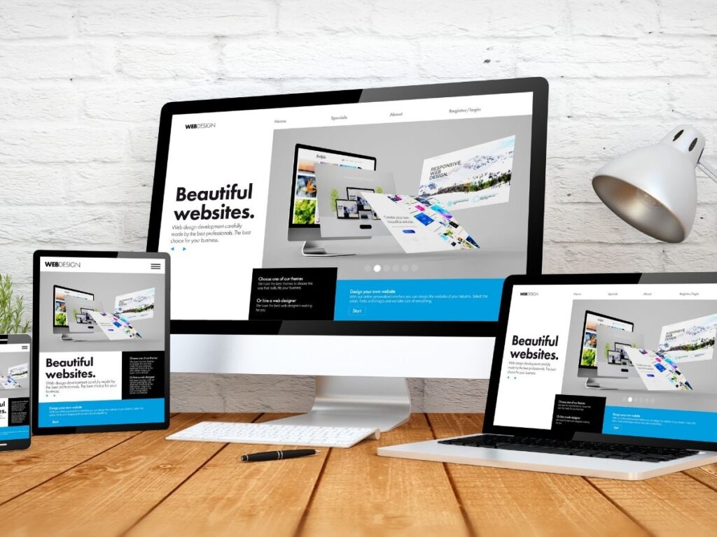
The digital revolution requires designs that can change and work well on mobile devices. Traditional desktop-centric methods no longer suffice. Modern designs cater to many devices, from smartphones to tablets and beyond.
User Experience (UX) Takes Center Stage
UX is the heartbeat of modern design. The color palettes, typography, and navigation elements work together to guide users on the site.
Integration of Multimedia
Textual content, while vital, is now complemented by multimedia – be it videos, animations, or interactive charts. These additions, used, make content more prosperous and more engaging.
Sustainability
The digital world’s expansion comes with environmental concerns. To address this issue, designers use green hosting, efficient coding, and optimized graphics.
Inclusivity and Accessibility
Modern design champions inclusivity. The website considers the different people who use it. It has unique features like screen readers and easy navigation. These things make the website more accessible for everyone to use.
Differences Between Traditional and Modern Designs
As the digital realm evolved, so did the philosophies governing website design. Let’s delve deeper into the contrasts between traditional and modern website designs:
Traditional Designs:
- Graphics-Centric: Earlier designs leaned on intricate graphics, sometimes overshadowing the content.
- Desktop-Focused: They were built for desktop view, often neglecting mobile users.
- Static Layouts: Pages had a fixed width and design, making them less adaptable to varying screen sizes.
- Limited Interactivity: User engagement was often restricted to primary navigation.
Modern Designs:
Modern website designs prioritize user experience over mere aesthetics, ensuring effortless navigation.
Mobile-First Approach:
Recognizing the dominance of mobile users, contemporary designs focus on mobile optimization.
Fluid Layouts:
These designs look the same on devices from big desktops to small smartphones.
Enhanced Interactivity:
Modern designs use animations, chatbots, and interactive menus to make browsing more immersive.
Tips from Tulsa’s Leading Designers
Tulsa, an emerging center for digital design, is home to several leading minds in the web design field. Their collective wisdom has valuable insights if you want to understand modern design techniques.
Mobile Responsiveness
In our mobile-centric era, a site’s adaptability is paramount.
- Adaptive Design: Ensure your website aligns with various devices, offering an optimal view. Whether it’s on a smartphone, tablet, or desktop.
- Prioritize Essential Content: Streamline content for mobile view, ensuring only pivotal information displays. It enhances user experience.
Visual Hierarchy
Directing user attention is essential.
- Strategic Placement: Ensure key content takes center stage, making it easily accessible.
- Use of Colors: Harness the power of color psychology. The right shades evoke emotions, drive user action, or highlight essential information.
Interactive Elements
A modern site is more than static content.
- Purposeful Animations: Strategic motion can add dynamism to a page. But subtlety is critical; you don’t want to distract or annoy users.
- Feedback Loops: Interactions like button clicks should offer visual or tactile feedback. It’s assuring users their actions have taken effect.
User-Centered Design
It’s all about the end-user.
- User Testing: Regular assessments can offer insights into user preferences, guiding design refinements.
- Personalized Experience: Modern tools allow for content adjustments based on user behavior. It offers a unique experience for each visitor.
Simplicity and Minimalism
A cluttered site can deter users.
- Whitespace: Embrace empty spaces. They offer visual relief, making content more digestible.
- Clear Call-to-Actions: Direct users with unmistakable prompts, ensuring they know the next steps.
Benefits of Embracing Simplicity and Minimalism in Website Design:
The digital world is leaning towards simplicity and minimalism, and the reasons for this shift are many and compelling. Here’s a deeper dive into their significant advantages:
Enhanced User Experience
At its core, simplicity equates to user-friendly experiences. Users can easily find information by removing unnecessary elements, making their browsing experience smooth.
Faster Load Times
A minimalist design approach, devoid of heavy graphics and redundant plugins, translates to rapid page load times. Fast-loading pages are essential to keep users interested and prevent them from leaving too soon.
Highlighted Key Content
By keeping things simple, we can focus on what’s essential and grab the user’s attention.
Timeless Appeal
A minimalist website exudes a timeless elegance, reducing the need for frequent redesigns to stay modern.
Improved Conversion Rates
Clarity and ease in navigation translate to users spending more time on the site and taking desired actions, sign-ups, or purchases.
Tulsa’s Contribution to Modern Design
Tulsa, a city steeped in rich cultural heritage, is now emerging as a powerhouse in the digital design domain. Here’s a deeper look at its transformative journey:
Innovative Design Studios
Over recent years, Tulsa has seen a significant rise in design agencies. Each of these studios brings its unique flair and approach, adding to the city’s rich mosaic of digital design. Tulsa is becoming known as a lively center for digital innovation, where different ideas come together to make the city even better.
Education and Workshops
Tulsa strongly emphasizes nurturing future digital design talents through consistent workshops and courses hosted by local educational centers. The city is cultivating a new generation of design enthusiasts. These initiatives give people the latest design techniques and make Tulsa a leading town in digital design education. This helps Tulsa stay at the industry’s cutting edge.
Local Inspiration
Tulsa has a mix of old and new buildings, making it a great place for designers. Designers have a unique canvas to incorporate Tulsa elements in their digital designs. This canvas blends old and new, providing endless creative possibilities.
Community Collaboration
In Tulsa, the design community is more than just a group; it’s a family. This tight-knit community thrives on collaboration, sharing insights, and uplifting each other. Such a collaborative spirit spurs innovation and ensures the city’s design scene remains vibrant.
Tulsa combines its rich history with a modern design approach, making it a leader in website design worldwide.
Conclusion
Modern website design is ever-evolving, demanding adaptability to stay relevant. As the digital scene shifts, staying abreast of trends is crucial. For those navigating the design waters in Tulsa, WebbDesignz stands as a beacon of expertise. Yet, amid the changes, one principle remains steadfast: the user comes first. This user-centric approach is the essence of contemporary website design. Embrace innovation, but always prioritize your audience.


